Maps and views blog

Cartographic perspectives from our Map Librarians

13 posts from April 2010

29 April 2010

Last 24 hours of the exhibition build

Photos by my colleague Dave Dubuisson as promised. Some of the exhibits are very large and present quite a challenge.

Maps31

Maps23

Maps26

Maps28

Maps36

Finally a preview of one of the 'interactives' that allow you to examine four maps in detail. Although it's designed to look like a magnifying glass, it isn't. It's much more complicated! When you visit the exhibition (from tomorrow) you'll be able to see how it works.

Interactive

On the website - now live - you can use our adapted zoomify tool to get a similar experience. Zoom in close and read our curators' notes about some of the details.

28 April 2010

The beginning is nigh!

'Is this the end or the beginning?' I have been asking myself today, while the final pieces of our cartographic puzzle fall into place. A big question but unusually (as far as big questions go) one with a clear definite answer: we are most certainly about to begin. This past week has seen Magnificent Maps become fully formed, with maps arriving daily from the conservation studios and being placed on walls. Thanks to our team of conservators and, once again, to our expert exhibitions staff.

Of special excitement this week has been the arrival of the nine loan maps from the extremely generous lenders. I was especially pleased to see the colossal de' Barbari map of Venice from 1500, lent by our friends the British Museum, when I popped down to the gallery one morning. In fact, I liken the effect to running downstairs to the letterbox one morning back in the mid-1980s and seeing my first Beano lying on the doormat.  Other incredible objects are Middle Temple Library's Molyneux globes of 1592 - the first English, and at the time largest globes in existence, and the medieval Evesham World map. Today saw the installation of the earliest map in the exhibition, a fragment of the Forma Urbis Romae, part of a colossal map of Rome dating to 200 AD. I can say with absolute sincerity that no reproduction in any book can compare with the effect of seeing the original.

Dave has been diligently taking footage of these and other maps (such as the Klencke Atlas) being installed, and you'll be seeing some highlights here in due course.

Peter and I have been giving a number of interviews to press, radio and television reporters, which looks set to continue tomorrow with the official press view of the exhibition. A recent highlight is The Guardian's art correspondent Jonathan Jones's typically perceptive piece last Saturday, while the first exhibition review appears in today's Times Online. There has been similary good feedback from British Library colleagues who accompanied Peter and myself on a number of preliminary tours today. Now although they are all extremely polite people, I am sure that their complimentary comments were not borne purely out of politeness. It is nearly time for you to make up your own mind.

Exhibition build update

The British Library's PACCAR Gallery has been a hive of activity these past three weeks, as Magnificent Maps takes shape. In an atmosphere of calm chaos (or chaotic calm, not sure which), contractors, conservators, technicians and the quite brilliant exhibitions team have brought to life something that has hitherto existed only on paper.

And as for me, I've been mostly getting in people's way, wandering aimlessly through the gallery with a big grin on my face. It is looking good. A few images will show you what I mean. Below: the 'Gallery' section of the exhibition at the start of the week, our own Renaissance Palace taking shape. It must be one of the few times that the entire height of the exhibition space has been used. Wait 'til you see the finished room. 

IMG_0472

Below: Conservator-artist-genius Eneko Fraile has been piecing together the 25 sheets of the massive Bohemia map of 1722. Such was the size and complexity of the job (each sheet was trimmed at some point 250 years ago, and perhaps unsurprisingly, not all of them match up) that the job had to be carried out in situ.

IMG_0497

Below: Colin contemplates the installation of the earliest surviving Chinese Globe (1623), a rather large, old and important ball of solid wood (the globe, not Colin).

IMG_0502

Most excitingly of all, the loan items have been arriving in the gallery. Of which more later.

24 April 2010

The Beauty of Maps #4

BBC4's The Beauty of Maps ended on a high last Thursday night, with part 4 focusing upon political cartoon maps of the 19th century and since. Everyone will be familiar with political illustrations that incorporate maps, but it was good to be able to chart their beginnings through the octopus maps of Fred Rose, through to that horrifying yet utterly mesmerising Churchillian octopus map of 1944. Ouch. Not pulling any punches that one - but the lesson is surely that if you dish it out (as Rose's octopus did) you should also be able to take a few.

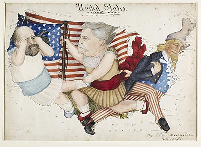
What always strikes me about these cartoon maps or 'serio-comic' maps is the wonderfully modelled, coloured and complex imagery, which seems to leap out of the page at you. They were designed specifically to be noticed, and through being noticed, their political messages found their way into people's minds.

To be honest, half an hour didn't seem like quite enough time to feature everything. Last night's programme wasn't able to look at, for example, the far earlier 16th-century maps which show continents as animals, and we didn't get a glimpse of the extraordinary map cartoons of Lilian Lancaster:
LancasterUSA
Nevertheless, the series was a triumph, with almost half a million people watching the first episode. I'd like to congratulate Stephen Clarke the director, and all of the British Library staff who made it possible. Of course, nothing would have been possible without the British Library collection to draw upon, and I should point out that nearly all of the maps featured will be included in the Magnificent Maps exhibition, the opening of which is almost, very nearly upon us...

23 April 2010

The Beauty of Maps #3

Ah, beauty is all around us: in the air we breathe, the people we meet... and the maps we look at. Last night's programme on BBC4 focused upon the incredible cartographic production of the 16th- and 17th-century Dutch printing houses, which managed to fuse scientific precision and elegant artistry within a range of maps, atlases and globes of supreme quality. We had a few surprises: for example, the fact that the atlas by Mercator - father of the atlas - bombed when it was first published. Who would have thought, from such an ignominious beginning...?

You were treated also to the now very well-known Klencke Atlas of 1660 being taken out of its case and looked at on a table. Not the sort of thing to take to read on a train, the Klencke has always been seen as one massive book, which of course it is. However it is really a 'composite' atlas: that is, a book made up of many previously published maps, especially for one purpose. The fact that these maps were all originally intended as wall maps says something of the huge over-the-top gesture made by Klencke when he presented it. Perhaps ironically, it is purely because of the fact these maps were bound up in a book that they have survive.

Early next week we shall be moving the atlas into the PACCAR gallery, which will be a photo opportunity in itself. But with all the photographs and coverage the atlas has had, I still do not think that anyone can properly appreciate its scale and conception until they've stood next to it. I've never been scared by a book before (not even Enid Blyton's Five go Down to the Sea), but the unnerving feeling of standing next to a book both bigger and heavier than oneself needs to be experienced by all. Opportunity to see it from next Friday.