Maps and views blog

Cartographic perspectives from our Map Librarians

4 posts from June 2010

17 June 2010

David Starkey and Peter Barber

A formidable double act indeed.

We now have a podcast of 'The Map in the Palace' event, recorded in our Conference Centre on 14 June.

The inimitable Dr David Starkey and Head of Maps Peter Barber discuss the importance of maps in medieval and early modern palaces, and how they combined art, science, and power to enhance their impact.

Warning! It lasts for 70 min 38 sec, so don't try to download it if you are on a slow internet connection.

(Or play it in your default media player.)

This link will take you to our Magnificent Maps podcast page

16 June 2010

The Maps in Context Symposium

A big thank you to everyone who attended the British Library academic symposium 'Maps in Context' on Monday afternoon. The event featured six papers which looked at the display and function of maps within their original settings. These included the Elizabethan Sheldon Tapestry maps (presented with some superb images by Hilary Turner), the political circumstances which motivated Fred Rose's Serio-comic Maps (Rod Barron), the crescent moon in European mapping (Lauren Beck), and the role of military maps of Scotland in the 18th century (Carolyn Anderson).

Another of the papers, by Genevieve Carlton, emphasised many of the problems which greet researchers looking into the display and reception of early maps, in Genevieve's case the 16th-century Venetian home. Inventories and lists of contents of these places are seldom so specific as to state implicitly the author, date, or subject of maps, and there is usually great ambiguity whether that discussed is a map at all. I know that this is something that affected Magnificent Maps, which was organised as far as possible upon documentary evidence for the types of maps selected.

We were treated to a perceptive evaluation of the modern map exhibition by Chris Perkins, who curated Mapping Manchester at the John Rylands Library last year. His compelling case for maps obtaining fresh histories from their modern display was based on visitor feedback, types of marketing and publicity, choice of exhibits, and reference to the present blog. Paranoid? I don't know what you mean!

The contextual approach to maps is very much a theme of the exhibition, and of the study of maps in general since the 1980s, the History of Cartography series, conceived by Brian Harley and David Woodward, advocated a social and cultural history of mapping. One of the aims of the symposium was to suggest that whereas map historians place maps within their contexts, historians in other fields could do worse than develop their contexts with the aid of maps.

14 June 2010

Magnificent maps that didn't make the exhibition #3

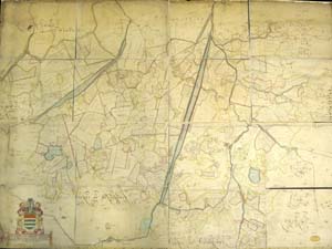
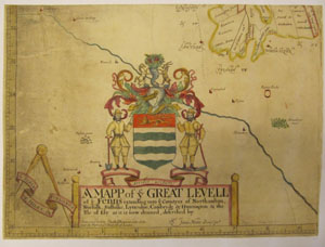
A Map of the Great Levell of the Fenns...
by Jonas Moore.
London, 1658 (1824)
copperplate engraving on 16 sheets, 143 x 198 cm.
British Library Maps 184.l.1
IMG_0643rz 

There are two perspectives on Jonas Moore's map of the English Fens. On the one hand, it is a very large and dull map of one of the most featureless parts of England, which focuses upon the intensely dull subject of irrigation.

Alternatively, it is one of the real great British maps, a colossally expensive printed map of an up-and-coming part of eastern England, which celebrates one of the most important and multi-national business ventures of the seventeenth century. It even has great in its title.
IMG_0637rz 

The map commemorates the draining the English Fenland undertaken by the Bedford Corporation from the 1630s. The project promised the development of vast areas of rich pasture land (big money stuff), and involved a lot of digging, channelling and sluicing, planning, negotiation and investment.

Sir Jonas Moore (1617-1679), an ambitious man of surveying and mathematics, produced the map to commemorate the success of the project, finished by 1656 and approved by the appointed commissioners. The investors got their return (unsurprisingly, since many of them also sat on the commission), and there was much rejoicing. They also would have got a copy of the map to put on their wall as a symbol of their success. If you look at the map, you can see the newly-dug channels stretching diagonally across the land, carrying the excess water out to sea; incredible, almost violent changes wrought upon the land. The project had literally changed the face of the land, and the map proves it. This was big-business, 17th century style.

Only one example of the first edition of the map survives, in The National Archives at Kew. This has the arms of each of the investors around the edge of the map, which were removed from subsequent printings as many of the men were to see their positions compromised with the restoration of the monarchy in 1660. The map was re-printed a number of times, even as late as 1824, suggesting that a century-and-a-half later it had assumed an almost iconic significance.

Moore's map has been termed 'a giant amongst early English printed large scale topographical maps,'
but magnificent? The jury's still out.

03 June 2010

Magnificent Maps that didn't make the exhibition #2

“The Red-Lined Map”

by John Mitchell.

London, 1775 (with manuscript additions to 1782)

Copperplate engraving on 8 sheets, 136 x 195 cm.

British Library Maps K.Top 118.49.b

Red line 
John Mitchell's The British and French Dominions in North America is a hugely significant map with an incredible history, and one would have thought The British Library's copy of it - 'The Red-Lined Map' - a dead cert for inclusion in Magnificent Maps

Mitchell's was the most up-to-date map of North America from the 1750s, but by 1783 its title at least was out of date, since the 'British and French dominions' had become the 'newly independent and victorious United States of America' after the British defeat in the American War of Independence that same year.

Now here is the interesting part. The British Library's copy of the map was actually used by the British delegation in negotiations for the Treaty of Paris, which established the terms of the United States' independence. Red lines were drawn onto it by British delegates to show the proposed new borders of the country. Hence the 'Red-Lined Map' moniker. 

But here is the even more interesting part. If you look at the map you'll see a red horizontal line running across northern Canada, far further north than the eventual U.S.A.-Canadian boundary, established in 1783. Clearly the British were prepared to surrender far more land than they eventually did, and so scared were they at this being found out that successive governments forbade unauthorised access to the map in the British Museum until 1896.

I bet they wished they'd used a pencil.

And so why, you ask, why did this cartographic colossus not make the exhibition? Well (I answer), the map deserved a rest after appearing in the amazing Maps: Finding our Place in the World in Chicago in 2007-8, as well as in the British Library's own Lie of the Land show of 2001-2. Perhaps more importantly, we were keen to include as many lesser-known maps as possible, so we opted for a different side of the story to the 'Red-Lined Map', and a map which has lived in its shadow for too long. Abel Buell's map of 1784 is the first map of the United States to have been made by an American, and a true demonstration of national pride. Come and see it if you possibly can. Let nothing stand in your way.