03 August 2016
Magnificent Manuscripts Online: Pelagios

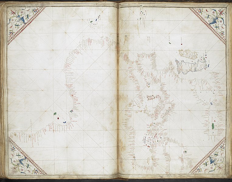
Above: Portolan chart of the North-West coast of Europe, including all of France, the British Isles and Ireland, Grazioso Benincasa [1473, Egerton MS 2855, f.8r]. File at Wiki Commons.
.jpeg)
Over the past few years the British Library has been working with the Pelagios project, making innovative use of historic manuscript maps. Meaning ‘of the sea’ the name Pelagios is used as the seas were the highways of the ancient world, much like the Web provides a highway for communication today. A web-based project that facilitates the online linking of data about ancients sites mentioned, for example, in texts, local histories or where archaeological remains have been found. The current phase of Pelagios (in which the Library was involved) will soon be drawing to a close as the next phase, 'Pelagios Commons', begins and runs to December 2017. The Library has contributed digitised materials to phase 3 of this project, predominantly in the form of mappae mundi, itineraries and portolan charts, and these have been digitally annotated to open up the enclosed geographical information to the Pelagios database.

Above: A map of England, Northern France, Scotland and Wales from Insularium Illustratum, Henricus Martellus Germanus [1495, Additional MS 15760, f.53v]. File at Wiki Commons.
.jpeg)
As you can see, the material provided to Pelagios is something of a treasure trove of manuscript views of the world and the project as a whole is composed of various wonderful resources detailed at Pelagios Commons. Now that our involvement with phase 3 of the Pelagios project is drawing to a close the Library is making the material it contributed to the project available on Wikimedia Commons and (soon) via data.bl.uk. The main root for material held on Commons can be found on the British Library Map Collections category page on Wikimedia Commons, which provides links to the various groups of British Library manuscript materials used in the Pelagios project (although I should note this is a general collections page - so you will not find Ordnance Survey Drawings in Pelagios!).
Above: General chart of the coasts of Europe, the Black Sea, the Mediterranean, and the western coast of Africa, Cornaro Atlas [1492, Egerton MS 73, f.36r]. File at Wiki Commons.
.jpeg)
One health warning about these manuscripts, due to UK copyright law they are technically in copyright until 2039. However, given the age of the manuscripts and their place of production the Library believes it highly unlikely a public domain release will offend anyone; more information can be found here. Copyright notices aside, this is a fantastic resource which we hope you enjoy. If you do dive make sure you clear your diary and sit down with some food to see you through, it's a fascinating collection of material. If you want to know more about Pelagios generally - and perhaps join in - head over to their Commons site. Here you can access online resources that are being developed (using open data methods) to link and explore historical place, as well as participate in various community forums. You can also find more at the Digital Classicist Wiki.
[PJH]
21 May 2014
Messing about with mappaemundi: The Virtual Mappa Project tools (1)
The previous Virtual Mappa blog post introduced you to some of the project's mappaemundi, and laid out some basic concepts that make medieval maps different from modern ones. This time, it's all about the DM annotation tools we've been using to markup the mappaemundi and add in the information we need to better understand them.
DM workspace, showing (L-R) the Royal Higden, Cotton and Psalter maps (London, British Library: Royal MS 14.C.IX, ff.1v-2; Cotton MS Tiberius B.V, f.56v; Add. MS 28681, f.9)
Currently, most people can only really appreciate these mappaemundi as images alone. The main barrier to understanding a medieval map is the Latin text it is written in. Most of the individual icons on the map have little labels or long paragraphs attached, written in a language many of us can't read. Without having the textual information accessible, you are essentially just looking at images - worthwhile in itself, but limiting.
A small selection of creatures from the Hereford Mappamundi which need nearly no words: the Marsok, Phoenix (yes, really) and Sciapod. Reproduced by permission of The Hereford Mappa Mundi Trust and the Dean and Chapter of Hereford Cathedral
For a traditional text like a book or letter, a facing page translation works just fine. With mappaemundi the text is embedded within the image, so getting a translation that's easily accessible without destroying the integrity of the image itself takes a bit of thought. In paper format it is almost impossible. But with the Virtual Mappa project we have some simple digital tools that can do the job well, and here, with some examples from the Hereford Mappa Mundi, we will explain how to use them.
Some nearly illegible text with Crete, Cyprus, and one other island from the Royal Higden mappamundi, Royal MS 14.C.IX ff.1v-2 (London, British Library). Any ideas?
Firstly, we want to make a marker to highlight an area of the map we are interested in, be it an image, piece of text, or both. There are various shape options available for making these markers, but I usually use the basic line-draw tool. With it you can simply underline a word, or create a complex shape marker for, say, a Lynx and its description (below).
Detail of the Lynx from the Hereford Mappa Mundi, marked up within the DM workspace. Reproduced by permission of The Hereford Mappa Mundi Trust and the Dean and Chapter of Hereford Cathedral.
Now you have a marker tied to the map image, to which we can begin to attach useful information. Rolling your cursor over the marker makes a pop-up box appear, giving the option to create an attached text annotation. You can add in whatever notes you want to make about the marked-up area. Basic text formatting options are available in the annotation window, and the markers' visibility can easily be turned on or off, for when you want to see the image unsullied.
Detail of Lynx and its transcription and translation. Reproduced by permission of The Hereford Mappa Mundi Trust and the Dean and Chapter of Hereford Cathedral.
Our annotations follow a basic template, giving a transcription of the Latin text and an English translation of the Latin. So for each piece of text on these maps, you will be able to rollover the marker, click on the pop-up box and read the translation in another window. Just adding this basic bit of information should make these maps much more accessible to everyone.
Details of a marked-up Salamander (left) and Mandrake (right) from the Nile Delta region of the Hereford map. Reproduced by permission of The Hereford Mappa Mundi Trust and the Dean and Chapter of Hereford Cathedral.
The aim of this project isn't just to have our map annotations available to view, though the in situ transcription and translation will certainly aid everyone's understanding. The point is that these tools are embedded in the software interface, so at some point in the future anybody will be able to make their own markers and annotations. Maybe you're coming at the documents from a different research background, interested in elements we haven't covered; maybe you'll spot something we didn't even see; or maybe you just think the Latin translation needs improving!
Generally, everybody organises their ideas and notes differently, and the Virtual Mappa Project is open and flexible enough to allow all users to look at the available mappaemundi and attach their notes directly to the digital images. It is an innovative way to engage with these complex, overtly visual documents, and I look forward to seeing how people make use of the annotation tools we are providing for this project.
Detail of Scandinavia (left) and a close-up on the famous Norwegian Simea (right). Reproduced by permission of The Hereford Mappa Mundi Trust and the Dean and Chapter of Hereford Cathedral.
Coming up next week will be some more about these annotation tools, but we'll be talking about linked data, and how just a couple of different "link" functions within the Virtual Mappa interface can help create incredibly complex connections, associations and pathways through your mappaemundi annotations, and out into the wider web.
Cat Crossley
14 March 2014
Good news for fans of medieval maps!
A new British Library collaboration called the Virtual Mappa project is well under way, using digital images of a selection of medieval world maps - mappaemundi - and some excellent new annotation software (more on that at a later date). High-resolution images of these maps will be available online for public use, with transcribed and translated text, notes, links to outside resources and other tools for understanding these marvellous mappaemundi. I'm the intern charged with annotating the maps and organising all this extra data. I've been up to my ears in Latin text, incredible images and software glitches for a few months now, so it is about time we started spreading the news about the upcoming Virtual Mappa project.
Psalter Map, (London, British Library, Add. MS 28681, f.9)
At first glance, you may not be able to recognise a medieval mappamundi as depicting the same earth we see in maps today, so some basics need addressing. Generally speaking, medieval world maps only show the continents of Europe, Asia and Africa, seen somewhat as synonymous with the Roman Empire. Australasia, the Americas and the polar regions don't tend to feature, as they were either unknown or considered to be uninhabited, or populated by 'savages', and therefore of little interest to the 'civilised' Christian populace creating and viewing these documents. And contrary to popular opinion, these maps don't depict a flat earth - it had already been known for centuries that the earth was a globe, and these maps simply attempt to model this spherical shape on the flat surface of a page, similar to the way a modern world map bends and stretches the continents to fit an image of the earth's surface into a neat rectangle.
The Anglo-Saxon World Map, aka the Cotton Map. (London, British Library, Cotton MS Tiberius B.V, f.56v)
It must also be noted that even though we call these documents 'maps', they contain a greater range of information than what we are used to with modern maps. Medieval mappaemundi were often more like encyclopedias in geographic form, containing a significant amount of history - especially events from the Bible - and even zoological and ethnographic information. Sometimes the whole of known history from Creation to the End of the World is depicted; monstrous races and mythical creatures abound on the more extravagant maps; and complex Christian connections and levels of meaning which we may never get close to decrypting flow through the map images and text.
Peterborough Diagrammatic Map (London, British Library, Harley MS 3667, f.8v)
The nine medieval maps we have been working with so far come from a timeframe covering several centuries, but have certain common characteristics: firstly, they're all world maps depicting a similar area of the globe (as discussed above). Secondly, they are orientated with East at the top, where modern maps have North at the top. This was standard practice for centuries, and when you learn that 'Oriens' means 'East' in Latin, it is easy to see where we get the English word 'orientation'. Finally, each of these maps was made in Britain, so unsurprisingly each one depicts the British Isles and Ireland, although the varying styles means Britain can look very different in each image.
Starkly different details of the British Isles and Ireland from the Cotton (left) and Peterborough (right) maps. (London, British Library, Cotton MS Tiberius B.V, f.56v ; Harley MS 3667, f.8v)
There are some similarities shared between these medieval maps, beyond the basics we've mentioned. Some of the maps clearly go together, for example the Peterborough (above) and Thorney (St John's Oxford MS 17, f. 6r) diagrammatic maps are effectively copies of each other. The two 'Higden Maps' (CCCC MS 21, f.9r and Royal MS 14 C IX, ff.1v-2, below) have the same colour scheme of turquoise and red, and probably both illustrated copies of Ranulf Higden's Polychronicon. Also, Sawley (CCCC MS 66, p.2) and the Hereford Mappa Mundi have some very similar elements which suggest they were both copied from a common ancestor. But there are far more differences that stand out...
The Royal Higden map - England is shown in red in the bottom left corner, with Wales and Scotland depicted as nearby islands. See the Medieval Manuscripts blog entry here for further images and information. (London, British Library, Royal MS 14 C IX, ff.1v-2)
The size of these maps varies enormously, for example the Psalter map is a miniscule 10cm square whereas the Hereford map stands at over 5 feet high. From this we know that one was a personal image for private viewing, and the other designed to be displayed and seen by a large audience. Style differs drastically, from the seemingly accurate 'wiggly' coastlines of the Anglo-Saxon map to the stark diagrammatic outlines of Peterborough. Even between similar sized maps, content can differ - the simpler Higden map shows placenames only, whereas Sawley fits in lots of biblical and ethnographic information in between its cities, rivers and mountains.
Detail of Monstrous Races from the Psalter Map (London, British Library, Add. MS 28681, f.9)
One of many lions apparently lost in Eastern Russia... (London, British Library, Cotton MS Tiberius B.V, f.56v)
The selected mappaemundi, then, vary greatly in size, style, content and purpose, can contain levels of meaning wholly lost on modern readers, and are written in the dead language of Latin. Good job that the Virtual Mappa Project will help us to make sense of them all! There really is much more to say about these magnificent medieval maps, so check back here for further images, updates and information.
- Cat Crossley
28 April 2010
The beginning is nigh!
'Is this the end or the beginning?' I have been asking myself today, while the final pieces of our cartographic puzzle fall into place. A big question but unusually (as far as big questions go) one with a clear definite answer: we are most certainly about to begin. This past week has seen Magnificent Maps become fully formed, with maps arriving daily from the conservation studios and being placed on walls. Thanks to our team of conservators and, once again, to our expert exhibitions staff.
Of special excitement this week has been the arrival of the nine loan maps from the extremely generous lenders. I was especially pleased to see the colossal de' Barbari map of Venice from 1500, lent by our friends the British Museum, when I popped down to the gallery one morning. In fact, I liken the effect to running downstairs to the letterbox one morning back in the mid-1980s and seeing my first Beano lying on the doormat. Other incredible objects are Middle Temple Library's Molyneux globes of 1592 - the first English, and at the time largest globes in existence, and the medieval Evesham World map. Today saw the installation of the earliest map in the exhibition, a fragment of the Forma Urbis Romae, part of a colossal map of Rome dating to 200 AD. I can say with absolute sincerity that no reproduction in any book can compare with the effect of seeing the original.
Dave has been diligently taking footage of these and other maps (such as the Klencke Atlas) being installed, and you'll be seeing some highlights here in due course.
Peter and I have been giving a number of interviews to press, radio and television reporters, which looks set to continue tomorrow with the official press view of the exhibition. A recent highlight is The Guardian's art correspondent Jonathan Jones's typically perceptive piece last Saturday, while the first exhibition review appears in today's Times Online. There has been similary good feedback from British Library colleagues who accompanied Peter and myself on a number of preliminary tours today. Now although they are all extremely polite people, I am sure that their complimentary comments were not borne purely out of politeness. It is nearly time for you to make up your own mind.
20 April 2010
The Beauty of Maps #1
Last night saw the opening episode of 'The Beauty of Maps', a four-part TV series being shown on consecutive nights on BBC4. The series was filmed last February in the British Library and elsewhere, and features some great footage of our collections, the St Pancras building and basement areas, staff and scholars.
It was great to see the finished product, and to see all the hard work and hours of filming condensed into half-an-hour.
... and if you look very closely, about 1 min 27 sec into the programme you can actually see my hand turning off a light switch. My Granny is very proud.
The programme has dove-tailed perfectly with the Magnificent Maps exhibition, especially since the themes being discussed tie-in with the specific spaces we have re-created in the gallery, and many of the exhibits contained therein.
Last night's programme focused upon the Hereford Mappa Mundi, in Hereford Cathedral. It brought out very strongly that the idea that the map is a complete summary of the world, its history, and everything in it. I found the sound effects that accompanied close-up shots of some of the map's many monsters and sea-creatures rather amusing. It gave me the idea of producing some sort of kids' pop-up sound effect mappamundi facsimile (copyright Tom Harper, 2010). Just for the kids, mind.
The programme featured the new facsimile of the original (and rather worn and battered) Hereford Map, produced this year by the Folio Society, a copy of which we will be featuring in the exhibition. The facsimile has, as far as possible, reproduced the original bright colouring the map would have once had. The director of the programme was keen to capture the surprise of map scholars when they saw it for the first time, something which came across very well. 'Better than the original!' Quite.
The Hereford facsimile will hang in the 'bedchamber,' the space in the exhibition that contains maps reflecting a spiritual or other-worldy power, suitable for the intimate space inhabited by rulers. You see, medieval world maps like the Hereford Mappa Mundi were not always hung in churches. In fact we can document instances of maps being presented and displayed in bedchambers, which incidentally were often used for meetings between a king or queen and his or her most trusted advisors.
Other maps we will be showing in this space are Grayson Perry's brilliant 'Map of Nowhere' of 2008 (also featured last night) which itself draws heavily on the now lost Ebsdorf Mappa Mundi of c.1300, represented in the exhibition by a true-size copy. Prepare to be amazed in a 'I can't see the top of it' sort of way.
In addition, we are pleased to be able to show the 13th-century Psalter world map, believed to be a copy of a much larger map owned by Henry III of England (reigned 1207-1272), and also the Duchy of Cornwall fragment, the only surviving section of a much larger medieval map.
So medieval map heaven, with added monsters.
Tonight on BBC4, 'The Beauty of Maps' looks at the mapping of London. Don't miss it.
Maps and views blog recent posts
- Human maps
- World Map World Cup: what happened and five things we've learnt
- World Map World Cup: Group 4
- World Map World Cup: Group 3
- World Map World Cup: Group 2
- World Map World Cup: Group 1
- Help us choose the British Library's favourite world map
- How Maps Got Into the Movies
- Magnificent Manuscripts Online: Pelagios
- Messing about with mappaemundi: The Virtual Mappa Project tools (1)
Archives
Tags
- Africa
- America
- Americas
- Architecture
- Arctic
- Art
- Australasia
- Black & Asian Britain
- British Library Treasures
- Business
- Captain Cook
- Central Asia
- Conservation
- Contemporary Britain
- Crowdsourcing
- Current Affairs
- Decolonising
- Digital scholarship
- Drawings
- East Asia
- Events
- Exhibition progress
- Georeferencer
- Georgians-revealed
- Germanic
- Government publications
- Humanities
- Italy
- K.Top.
- Landscapes
- Law
- Legal deposit
- Literature
- London
- Manuscripts
- Mappamundi
- Maps
- Medieval history
- Middle East
- Modern history
- Netherlands
- Off the Map
- Ordnance Survey
- Podcasts
- Press
- Printed books
- Prints and printmaking
- Propaganda
- Public domain
- Radio
- Rare books
- Research collaboration
- Russian Revolution
- Science
- Slavonic
- Social sciences
- Sound and vision
- South Asia
- South East Asia
- Spain
- Television
- Travel
- Unfinished Business
- Visual arts
- Watercolours
- Website
- West Africa
- Women's histories
- World War One